
Wet Bar Cabinet Redo
I slowly showed you little updates here and there all summer of this basement space. It’s the one spot in our house that never felt quite right. I started with getting rid of the too blue carpet that drove me nuts. I added the couch from upstairs and a new chair in the mix. Plus a coffee table and some new comfier game table chairs.
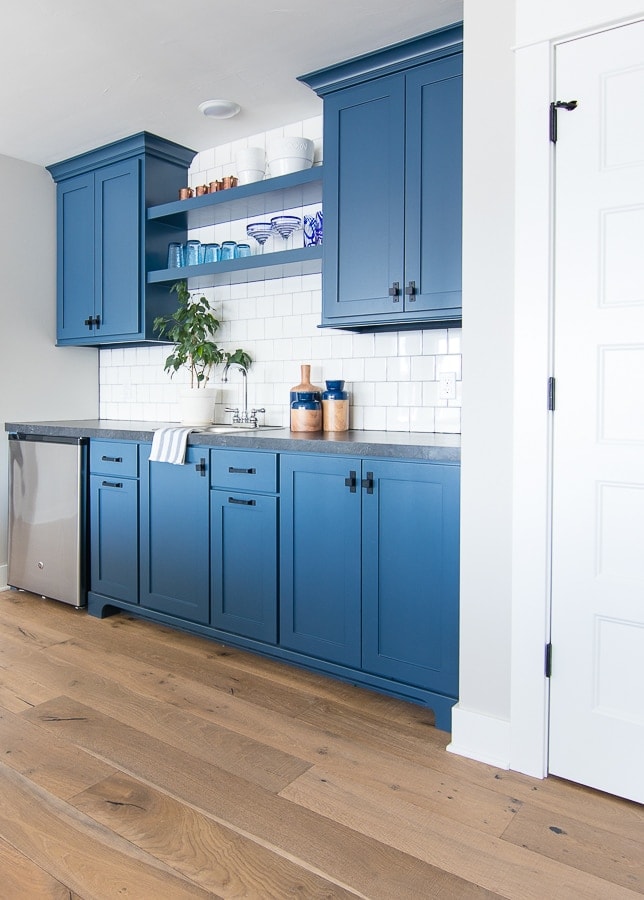
Next up is tackling the wet bar area on the opposite side of the room. If you remember the original plan was to put butcher block counters down here, but my contractor and I couldn’t really come to an agreement on what kind of material to use, so we last minute just popped a laminate counter on it. After building two houses, I will say this sort of thing happens sometimes at the end. You just really run out of steam after making 10,000 little decisions and sort of throw your hands up and say whatever!
It’s not my fave counter combo with the paint color. Let’s talk about paint colors a minute. This is the exact same paint we used at our old house in the laundry room – Newburyport Blue by Benjamin Moore. See how deep the blue is in here? I love it!
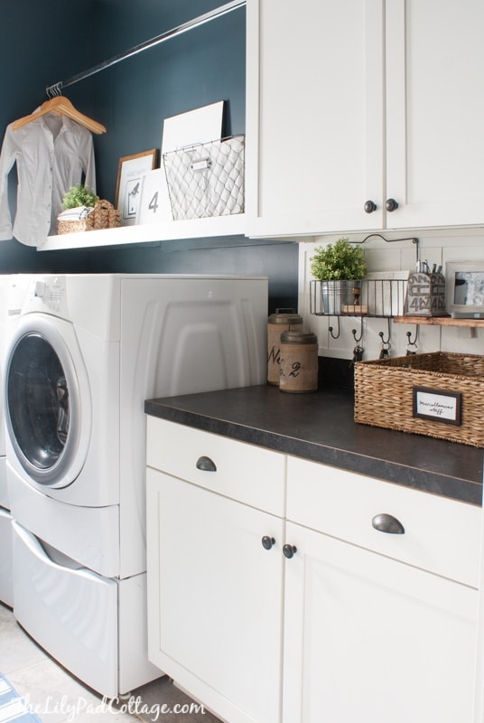
Now, look how bright it is in our basement. Definitely not the same look – isn’t that crazy!? I didn’t take into account the tiny little laundry room window vs the giant wall of south-facing windows the basement has.
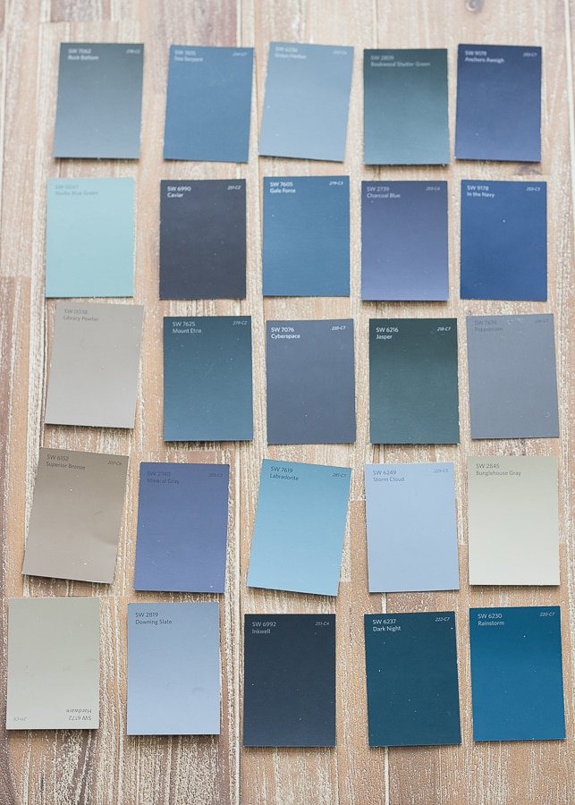
This is why testing specific colors in your specific space is SO important. I wanted an almost black blue and what I got is almost royal blue in person. It’s been bugging me since we moved in but I thought maybe if I change the carpet/couch/everything it will look better. Sometimes it’s just good to admit when you are wrong (do not tell the Mr. I said that!) and start over.
So, now that I’m resigned to painting these cabinets (not my favorite DIY) here are a few of the paint colors I picked up today that I’m planning on trying out. I’m thinking the Anchors Aweigh (top right corner) may be the first sample I pick up. I’m toying with the idea of a more gray tone too like Cyberspace in the middle there.
I also have plans to finally switch out these countertops for a butcher block I found at Home Depot. I don’t think they carried this option when I was looking the first time around.
Last, I’m debating spray painting this hardware or swapping it out. The black really just disappears on these cabinets. Again another oops! I’m starting with the cabinet color and I’ll go from there until the space feels right.
My kids have fall break the end of this week and we were all excited to be going back to New York for another hiking/yurt trip (you can read about that trip here – it was so fun!). BUT the Mr. fractured a bone in his foot last week running. So, hiking is definitely out for him. Thankfully, we scored some last-minute cheap tickets to fly down to FL to visit my parents instead and we are all so excited to hit the beach! Which made me think maybe I will do a blog post about our trip there or what fun things we like to do when we are down there? Leave me a comment below if there is anything you would like me to cover in a post about Florida when we get back!
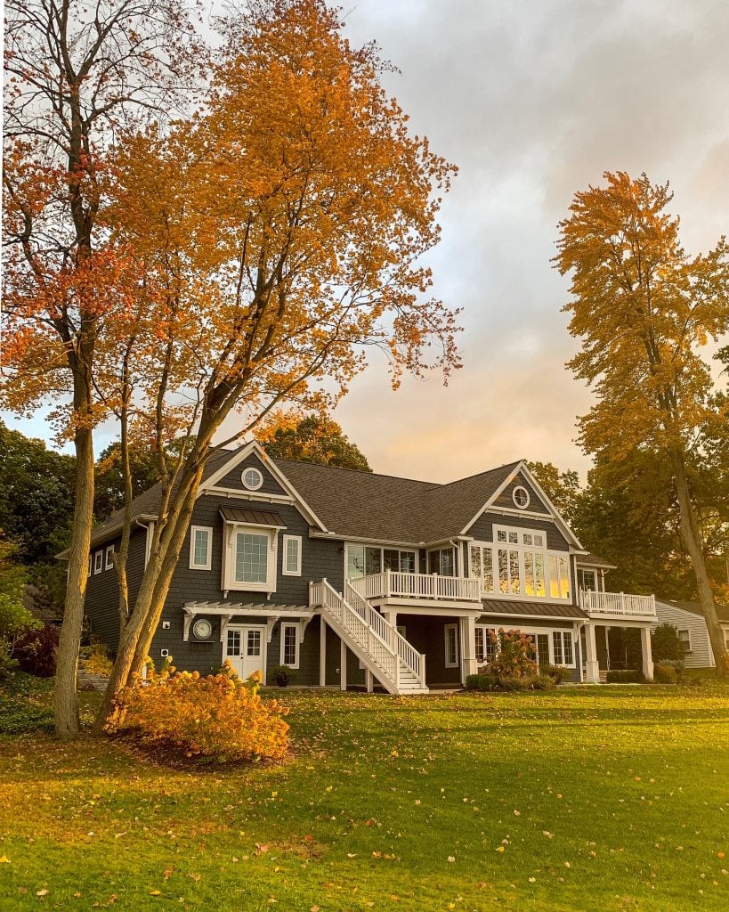
The only bummer is I think we are going to miss the peak color weekend here in Michigan, but I did snap this photo in my bathrobe and uggs this morning :) Had to catch that morning sunshine!!
And if you are new here, you can check out some of the fun transformations we did of my parent’s home
here for their kitchen makeover
and here for their living room makeover.
You can also find all of our house paint colors in this post here!
Have a great week!

I just went through the whole ‘dark navy’ search for our lake house exterior shaker shingles. Agree…most that look like dark navy end up being much brighter. I had it between Cyberspace and BM Raccoon Fur. I went with Raccoon Fur and love it.
Oh I love that paint name ha!
Your home is beautiful and shows how incredibly talented you are! Can you explain the ceiling treatments you did on the molding/board and batten? Or point me to a blog perhaps I missed? I have pine ceilings and walls but want the pine notches to come through the white paint. Yours looks more matte or is it just the photo? Also, my kitchen cabinets are cherry and my husband does not want them painted over. The kitchen is open to the living room so I am wondering if the white in living room will make the kitchen look awful w/ keeping cherry cabinets. Thank you for sharing your expertise with us. You totally rock!
I think a mushroom taupe/gray would look pretty with gold hardware. Then add some blue glassware on the shelves and maybe a pretty navy blue piece of pottery.
I’d like to try that route too but I can’t find anything that works well with the wall color.
Hale Navy by Benjamin Moore is a much darker (navy) blue that looks amazing on anything! Wall, cabinets and furniture. I looked at Anchor’s Away and found it too much of bright blue…which is what I think you were trying to move away from?
ben Moore Indi go go CSP 565 is a gorgeous navy
I’m dying to try their new century premixed paints. Delft UO is gorgeous! Blue muscari U9 too
I’ll check those out!
I’ve tried the Hale Navy and the sample doesn’t look right in this room. I’m still brainstorming!
I agree with the above comments… I would love to see your DIY steps to painting cabinets:) I look forward to your weekly blog posts and love your house!!
Will do! Thanks Alicia!
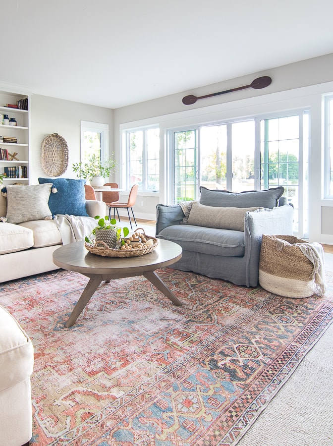
Can you link your rug in the first picture please?
https://rstyle.me/+gBHOwpcwArQSCfYHRAAGcQ Here is the link – thanks!
You captured a beautiful pic of your home…..perfect lighting!
Thanks Eileen!
Have a great time away and soak up that beach time – as we know, winter is LONG!
I am sure the cabinets will look great – love your style!
Thanks Jane we had the best time!
On your paint board I like Dark Night. It’s hard to tell in a photo, but the 2 you’ve chosen in the picture are already lighter from a window or your flash. But in the photo, in my opinion, the Dark Night has held its darkness, if that’s what you’re looking for.
I personally like Cyberspace. I believe it will shade more gray than blue to match your double chair.
Thanks Lisa, I plan on getting some samples to see how they look in the room first so we shall see!
We just painted our shutters SW Naval and everyone is commenting that they love it. The chip looked almost black next to SW tricorn. But when we got Naval on the shutters and Tricorn Black on the door you could really tell the difference. It’s a really nice dark navy and we are so pleased.
I’ll check it out thanks!
I was surprised that your favorite blue samples weren’t darker after reading that you initially were going for black-blue but like the direction you are heading. I painted my front door and shutters (front of house faces east and gets a half day of full sun) SW Naval. It wasn’t the color I thought I’d end up with but was the best choice after viewing on location. I think I could have gone darker still but get cold feet when I think of how many hours of darkness we have during our upper midwestern winters!
I guess I should have said I’m looking for a less blue blue, not necessarily a darker one. I may do more of a gray undertone vs blue, haven’t totally decided yet!
Can’t wait to see the new cabinets. If you’re in the Orlando area for Halloween, I can’t talk highly enough about Celebration. It’s a Disney inspired community within Orlando, with beautiful houses. They go way above and beyond with the Halloween decorating-many houses change the entire facade of their home. It’s amazing! We’re from Indiana and have turned it into an annual trip just to take the kids trick or treating there every year…so worth the trip!!
Oh fun! My kids aren’t really into Disney anymore but we may do Universal Studios at Christmas time!
Option to send out drawers and doors to be spray painted for you. Then paint just the boxes yourself. It costs a little more than DIY all of it yourself.
Maybe this is your plan—just thought I’d share. We bought a 15 years old home and replaced very worn maple finish with white paint-Love it! And I agree color is tricky. My vote share your Florida trip.
Hey Ruth that’s a good option! I do have a sprayer myself and it’s not that many cabinets so I may just tackle it myself – thanks!
All are beautiful colors! I just picked up Behr’s Submarine Gray as I wanted a very dark navy for a stencil project. In natural light ourside it reads datk navy, but less light the darkest gray without being black.
So sorry for your husband! Looking forward to your trip to your parents!
Thanks I’ll check it out!
I would love to hear about your FL trip..whatever you’d like to share really. But would be interested to hear how your parents like living in FL part of the year and part of the year in MI. How does that work for them? I may be close to your parents in age so that would interest me and, of course, anything about their beautiful home is always fun. Good luck with choosing paint colors…always a tough thing for me.
Hi Catherine I think they are still working out living part time both places. They’ve done it a little different every year the past 3 years and I’m not sure they have it down yet ha!
We painted our kitchen island with Benjamin Moore Hale Navy. And it is gorgeous. Our exterior of our home is the same color. Check it out – it is a deep deep navy.
Thanks Lisa, I tried that one but it didn’t work quite right with the wall color! It is pretty though!
Do you have the name or where you got your drawer pulls for your wet bar? Love your house!
Hey Shelly I got them at a local store here in Grand Rapids and I don’t have a brand name thanks!
Yes, choosing a paint color for a room with so much daylight can really be tricky. You might want to try painting out a BIG sample board that you can prop up in front of the cabinets to see how the color reacts with the bright light. I love being creative with cabinet hardware and yours is the wet bar ‘jewelry’ so I agree – paint it or swap it out. Have a wonderful time in Florida! Hope the Mr.’s foot heals up quickly.
My daughter is actually searching for a laminate counter exactly like that! Do u happen to recall the name? Many thanks!
Hi Patti I don’t know the name of this one, but I also don’t love it up close so I don’t think I would recommend it either!
Yes that’s what I normally do when picking colors and I will definitely do that again this time! Thanks Dori!
Love your blue color choices. The blue in the laundry room sure shows up different than in your basement..WOW!!! Amazing how colors can look sooo different depending on lighting. I just painted my mom’s farmhouse storm windows in Cyberspace. We all love it. That side of the farmhouse faces south too, so lots of sunshine !!! Definitely reads a black/blue or blue/black. I was really surprised when my mom chose the color because it seems so out of her character…LOL
Can’t wait to hear what you decide and to read about your trip to FL. Nothing like going to the beach in Oct when you live in Michigan. And by the way, the photo of your house in fall is absolutely stunning!!!! I truly would miss the season if I lived anywhere where there was no “October.”
Enjoy your trip :)
Thanks so much Dawn! Paint colors can be so crazy with the lighting for sure! We had a great trip to the beach, can’t wait to go back!
Just a heads up. I have Anchors Aweigh on my shutters of my house and they can read purplish when the light hits a certain way. I still love them but may have gone with Sea Serpent instead. I also used the Newport Blue on my wet bar (cuz I have a mini Lilypad lol) and it was not that light. I love the color! Anyway anxious to see what you choose!
Oh good to know thanks! Paint is so tricky with the changing light!
Yes-let’s see the parents house, where you will be in Florida (we live there in the winter) and things to do with the kiddos. Thanks!
Thanks Terry!
After reading about your yurt trip ,I booked the same place for my family. We’re less than 4 hours away so it was perfect and my kids loved it!
Oh yay I’m so glad you enjoyed it! It’s such a beautiful place!
Hi Kelly! I love the blue swatch you’re eyeing and definitely think you need to make a sample board for that space or however you do it ASAP and post it to your stories on IG so we can see. Personally, I love the black hardware for its color and shape but wonder if there might not be enough contrast if you went that dark on paint. Brass? Keep us posted and have fun in FL! Would love to know about any cool festivals down there that would warrant an October getaway. Their leaves change too…right? ?
Thanks Cindy! I love the shape of the hardware too which is why I might try to paint it but we shall see. I need to get Christmas stuff up and running first!
Will you give a step by step of how to paint cabinets?
Thank you,
Anna
I agree with Anna and would love to see a step by step how-to when you paint the cabinets.
Me too! Do you spray them? Roller? Brush?
I haven’t decided which route I will go, I’ve done all 3 of those methods! I will for sure share.
Will do Maureen thanks!
Yes will do thanks Anna!