
Light Gray Cabinets – Agreeable Gray
A white living room gets an update with light gray cabinets.
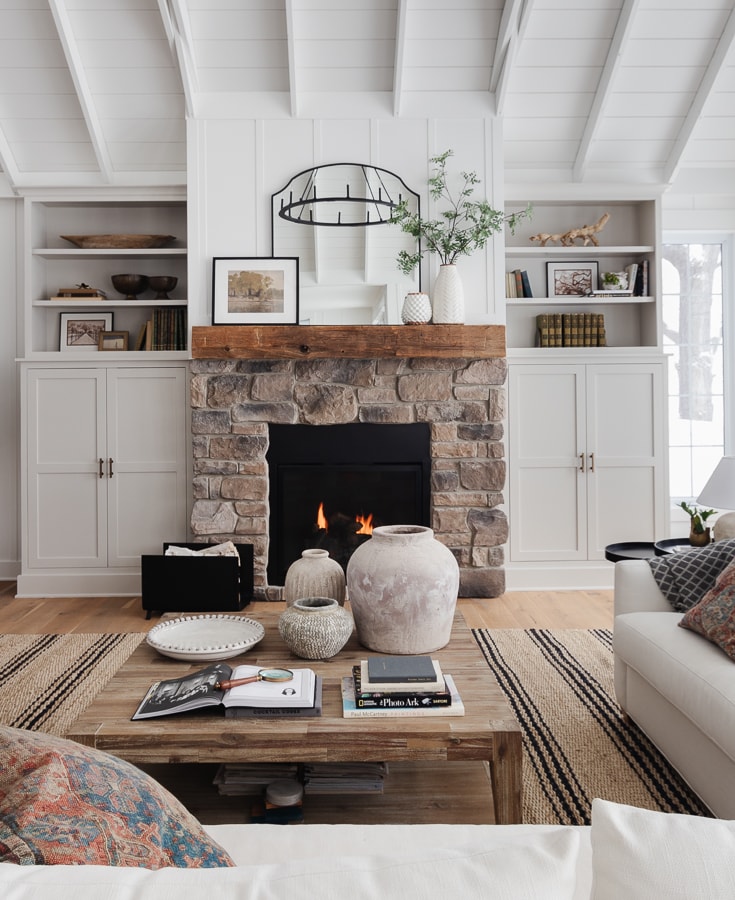
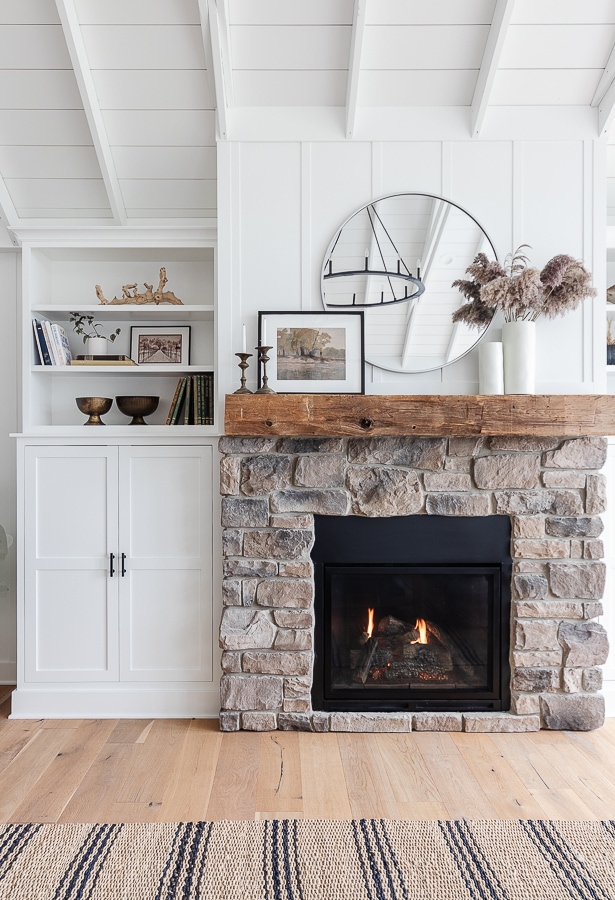
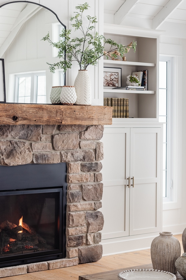
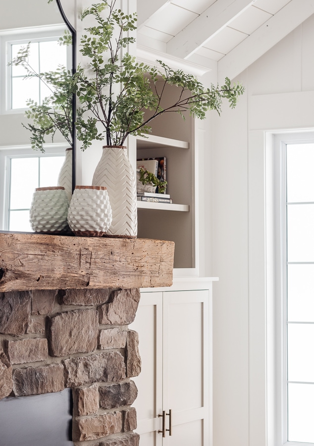
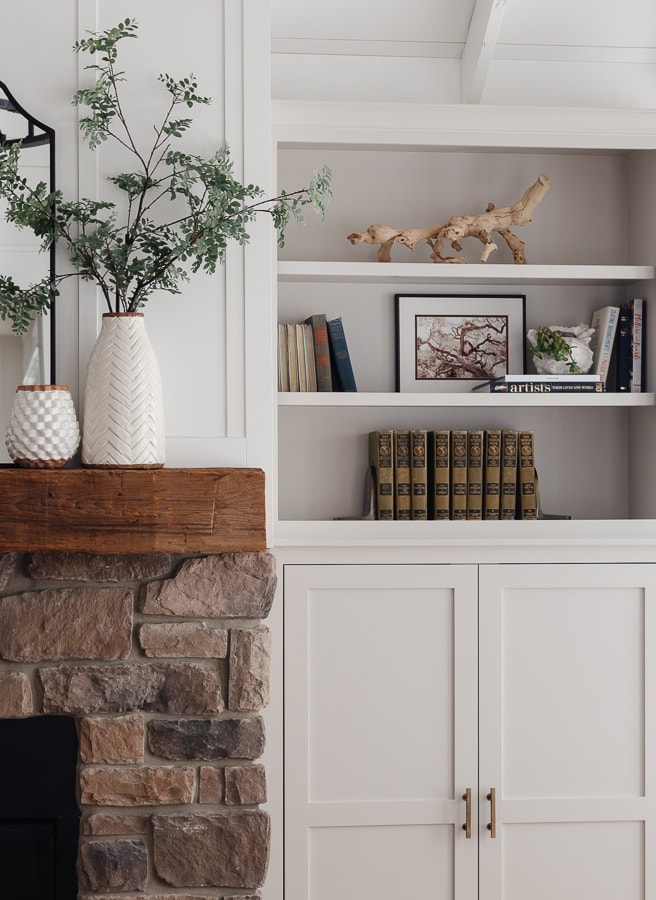
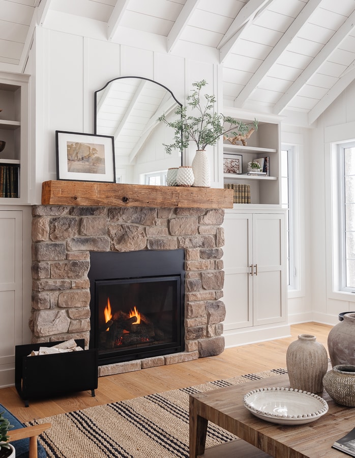
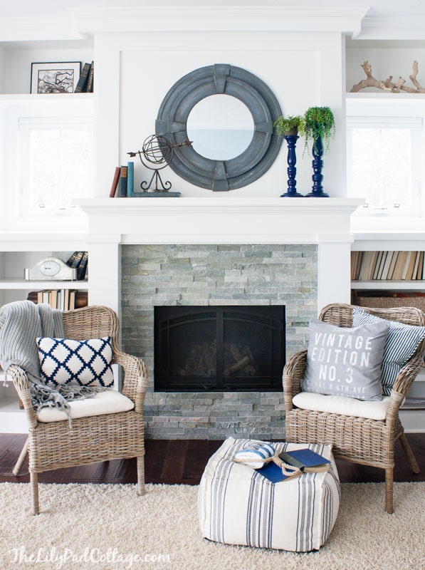
This may be the most subtle makeover in the history of all makeovers on my blog, and yet I love it! Our fireplace built-in cabinets were the same white color as our living room walls. I decided it was time for an update and painted these light gray cabinets.

I thought it would be a fun change to add a little more contrast in this space and paint the cabinets light gray. They needed a fresh coat of paint anyway, thanks to a hoverboard mishap…
Here’s the BEFORE:
And AFTER:
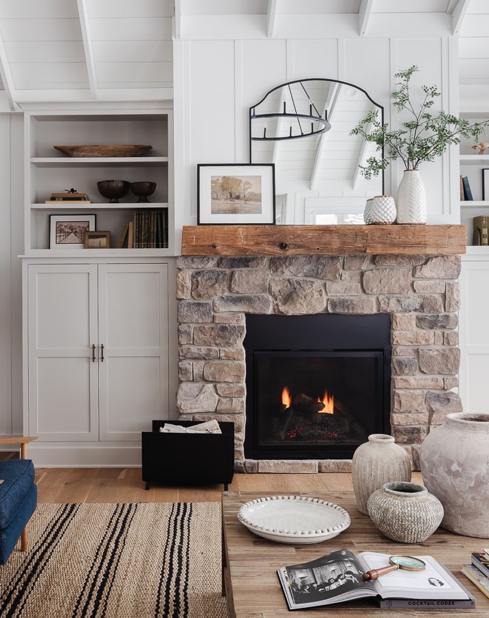
Can you see the difference? I recently painted our basement family room a charcoal gray, but left the Agreeable Gray walls in the hall. I decided to continue the Agreeable Gray paint color up here on the cabinets as well. I was looking for just a subtle hint of warmth.
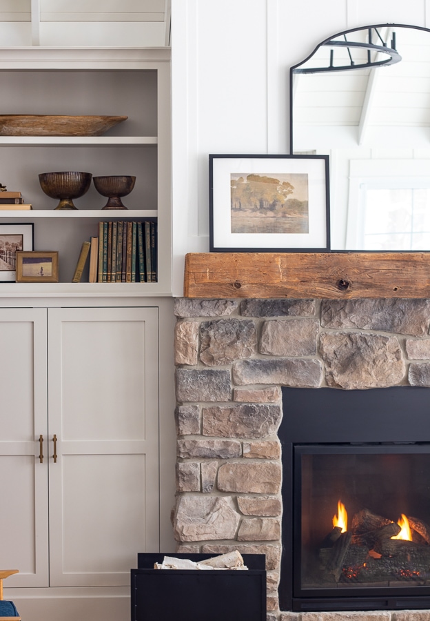
The subtle light gray cabinet color change has been tough to capture accurately in photos. Especially in the middle of the blizzard we are experiencing. It’s a little like an eye exam where the optometrist is asking “one…or two???” – and you can barely perceive a difference. However, in real life it added SO much warmth and contrast to the space. You may just have to trust me on this one!
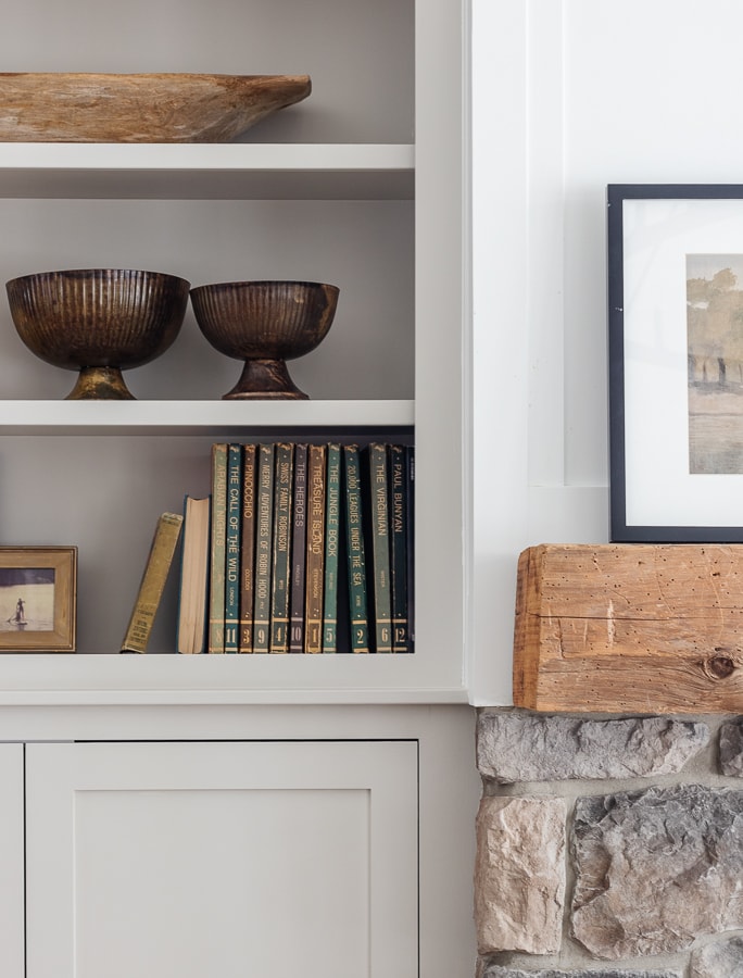
Here is a close up photo where you can see it right against the white paint.
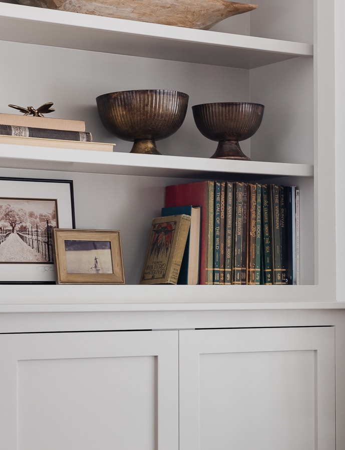
Agreeable Gray is a really nice greige tone that is warm without being pink or yellow. It’s a universal neutral color that works well in almost any space. I like to make sure all my paint colors flow together so using it again made sense.

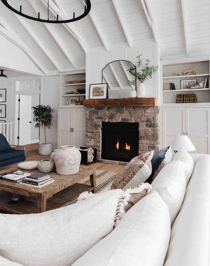
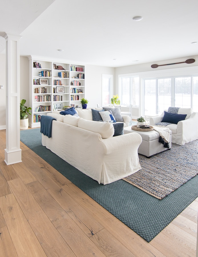
I really love our white walls 3 out of the 4 seasons here in Michigan. The point of having the white walls is to let the lake view shine. The wall color just fades into the background and the blue water and trees take center stage.
It’s just when winter hits that the wall of white snow out the window feels a little blah with the white walls inside. This little bit of color added to the living room was the perfect compromise. It won’t take away from the view in the spring, summer and fall.
Popular Cabinet Paint Color
I feel like there has been a trend toward cream and beige cabinets lately, which I love, but it also feels like a timeless choice as well.
Our putty colored cabinets in the basement wet bar are still a favorite of mine.
I love the gray cabinets in our little guest cottage kitchen as well. Paired with our soapstone looking countertops they also have a classic timeless feel.
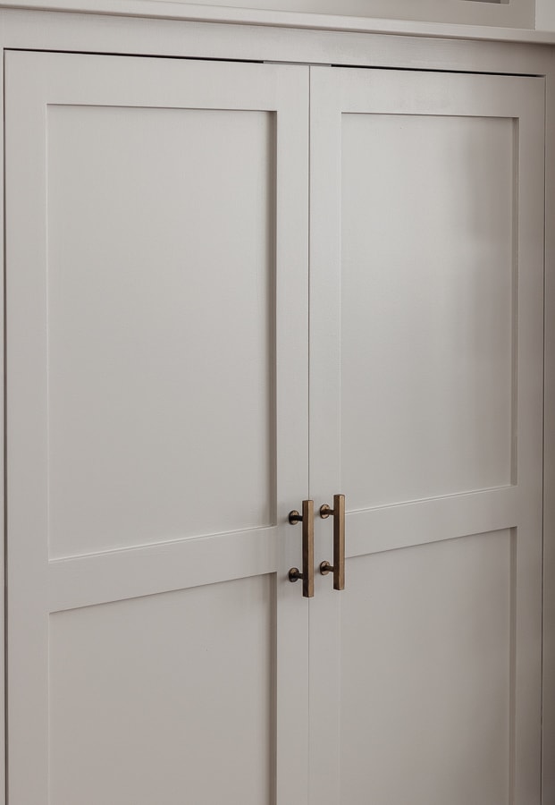
I updated the hardware with a little rub and buff brass paint. I like the softer look of the brass with the gray cabinets.
So what do you think, can you tell the cabinets are painted light gray now? Or am I a nut? Maybe don’t answer that…
You may also enjoy reading:
Disclaimer:This post contains affiliate links. I may receive a small commission for purchases made through these links at no extra cost to you. Just click on the BOLD links.
- Cabinet Color – Agreeable Gray by Sherwin Williams
- Wall Color – Extra White by Sherwin Williams
- Fireplace Stone – J&N Stone Quartz, Price
- Rug
- Sofa
- Accent Chairs
- Mantel Art – Juniper Print Shop
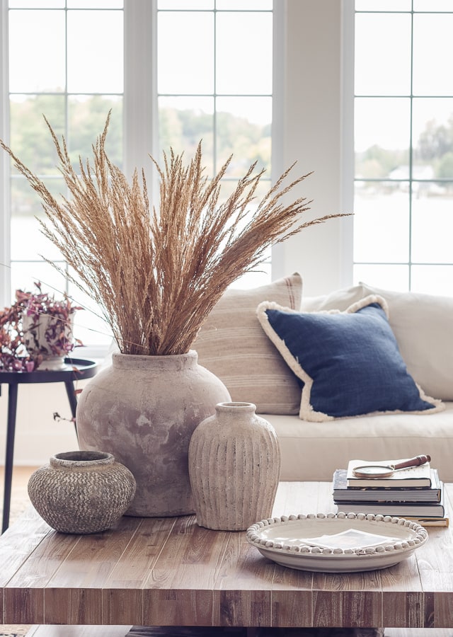
- Large Vase
- Small Vase
- Greenery
- Brass bowls – McGee and Co. no longer available
- Books – vintage
- Large Stone Vase
- Medium Stone Vase
- Small Stone Vase
- Mirror
- Velvet Pillow
- Paisley Pillow
- Brown Pillow
- Black End Tables


Just wondering if you use sherwin williams cabinet paint or do you have Agreeable Gray matched to Benjamin Williams Advance? If you stick with SW, what line for cabinets do you use? Thank you!
I had it matched to the Advance :)
How do you get such professional looking paint job – no streaks or aything! Whenever I paint something you can total tell its been refinished. You always get a nice factory looking finish. Amazing!
It’s all in the paint! Using a really high quality paint from the paint store. I use the same paint my painter used.
Did you use trim paint or flat paint?
You are so talented!! How do you have such an eye for the perfect color combos?! I am about to reno my master bath and my hubby is insistent on dark everything :( my dreams for a crisp clean master bath (after 10 years) may not happen… How do you get your hubby on board?
Dan has finally learned to trust that I know what I’m doing. Maybe show him some pinterest inspo pics to get him on board? Good luck!
Perfect, subtle but the color goes so well with the stone in your fireplace. It is so beautiful!!
Thanks so much Mary!
I love the new color! You’re right… it’s quite subtle but REALLY complements the fireplace stone. Beautifully! You always inspire me, Kelly.
Oh thanks so much Dori!
Beautiful!
Thank you!
I think it looks GREAT!! Subtle, but very impactful!!! Just gives it a little more warmth without being overpowering. Great job!!!!
Thanks so much Robbin!
I love the slight change of color. I didn’t notice it until you did the close up shots. I like how you give different angles with your camera. I’m a very visual person. In your list of products you didn’t mention where you bought your mantle. (I might have missed in a previous post) We’re building a loft and I would like to buy one if available.
Hey Debbie this was actually the original fireplace mantel in the old cottage we knocked down to build here. Glad we were able to reuse it.
I love the new gray color , your color palette is beautiful all round. Love seeing your pics. Thank you
Thanks Sharon!
I absolutely love it! And yes, I can definitely see the difference. It’s just perfect!
Thank you!
You are right. The new color doesn’t take away from the view, but it adds just a bit of warmth. I like the change! It’s a subtle change, but I like it.
Thanks Renee Dan thought I was nuts ha but I love it!
I love it. The reference to the eye doctor to explain the subtle difference is a perfect explanation.
Ha thanks!
Fabulous change !! I think it really brings out the stone of the fireplace also.
Thanks so much Margie!